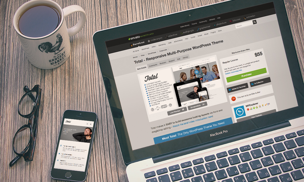
The design of your website plays a very important role in its success. If your website has a design that’s difficult to navigate through and has a steep learning curve, do you really think that visitors want to spend more than a few seconds on your page? Some of the world’s most popular websites are those that have simplistic designs that are easily navigable. For instance, think about major e-commerce websites such as Amazon. The website has a very simple interface that allows you to browse through the thousands of products on offer.

Even when you are searching for different products, there are always conveniently placed links that allow you to move from one page to another and find something that’s relevant to your search. Amazon, as you might know, is one of the world’s largest online retailers, registering billions in sales. Whether you are starting a blog, an ecommerce website, or virtually any other type of site, it’s important for you to make your website easily accessible. Many companies that specialise in Los Angeles web design have pinpointed common mistakes that most people make when designing their new website. Here are a few tips that will help you achieve success within a few months.
Remove Sidebars
One of the newest trends that you will notice in modern websites is that they don’t have any sidebars. Phasing out the sidebar is a wise move, especially for budding sites that are looking to generate maximum amounts of traffic. Originally, sidebars were designed to provide more content on one page. They would offer additional navigational flexibility and allow visitors to check out popular content without having to scroll further.
However, it’s safe to say that the project has failed. Sidebars do little else than create clutter on the website. When designing a website, think about the perspective of the visitor. If there’s too much information on one page, the user is going to lose interest very quickly and move away from your site.
Use Large Fonts
Another major trend that’s likely to continue well into 2017 is large typography. Gone are the days when websites featured small fonts to cram as much text on one page as possible. Larger fonts are going to grab the reader’s attention directly and put immediate focus on the content. This is a very important tip for blog owners—using larger fonts will help attract more interest to your page.
Space
Throughout this article, you may have noticed that a considerable amount of focus has been placed on decluttering. You don’t need to put everything on the same page. Instead, try to make your web pages as spacious as possible so that you have a considerable amount of white space, or negative space on your site. If you are using large fonts on your site, it’s going to leave a considerable amount of negative space. It’s vitally important that you follow these tips to make your website more responsive.

